
Dust off. Scale up.
Historyin Letters
Typeface Design for the Centennial of the 1923 Exhibition
The visual foundation of the project emerged through archival research. During the investigation,
a rare 1937 photo album was discovered, containing handwritten captions and comments. These
handwritten notes became the conceptual starting point of the project.
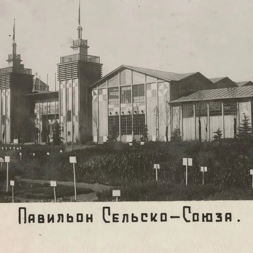


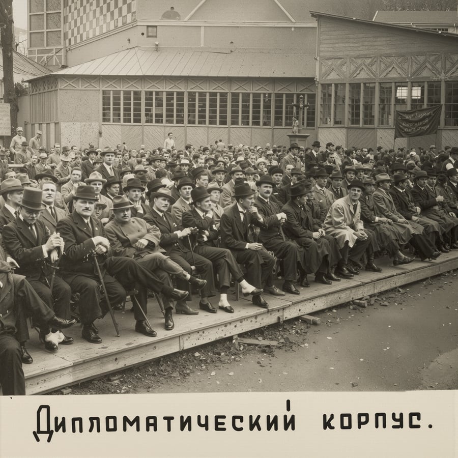

The captions were digitized and carefully transformed into a custom typeface. Based on the original handwriting, the typeface preserves the rhythm, fluidity, and expressive irregularities of the archival script. It serves as a link between the historical document and contemporary design, reinforcing a sense of authenticity.

